← work(BI05)
Blue Ice Cream
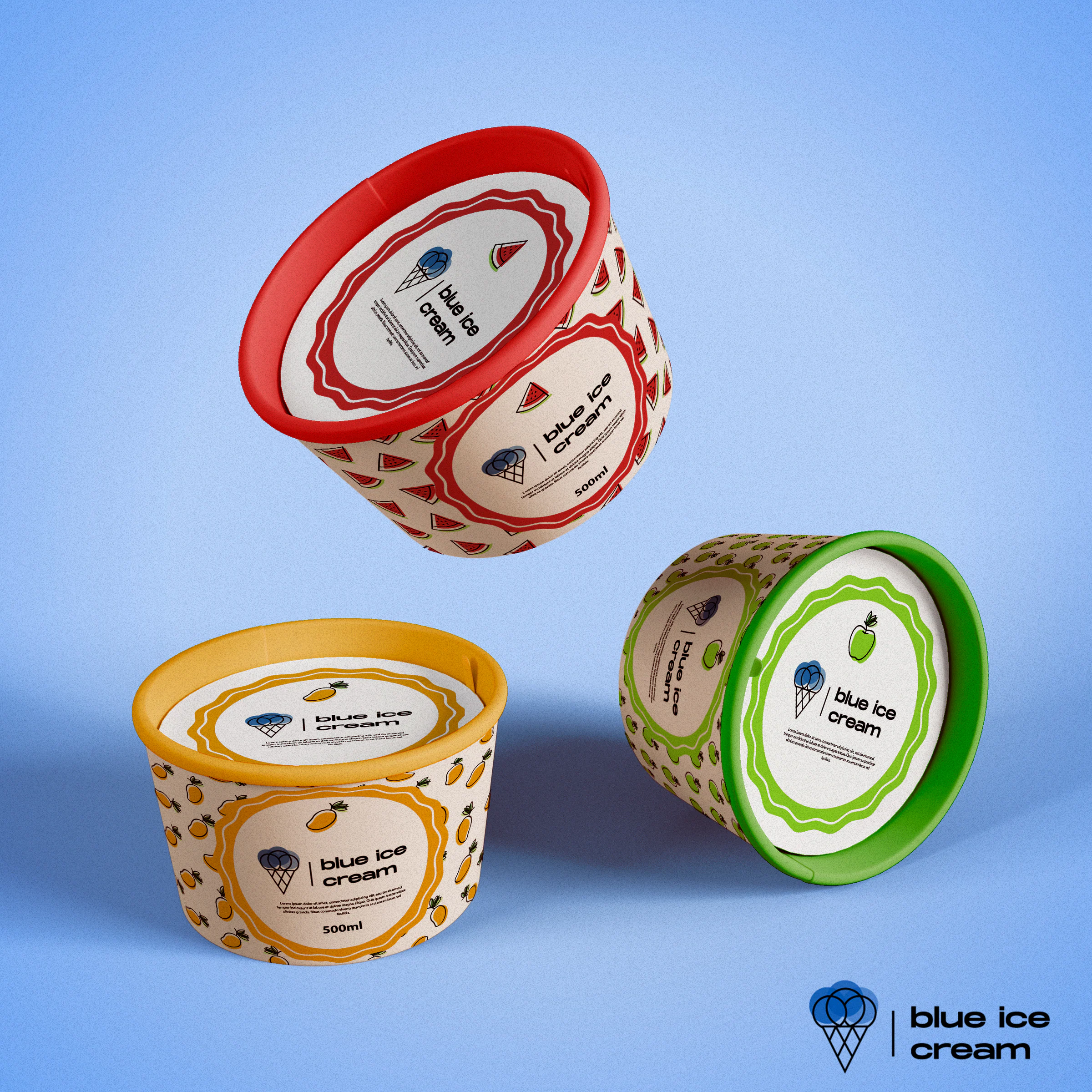
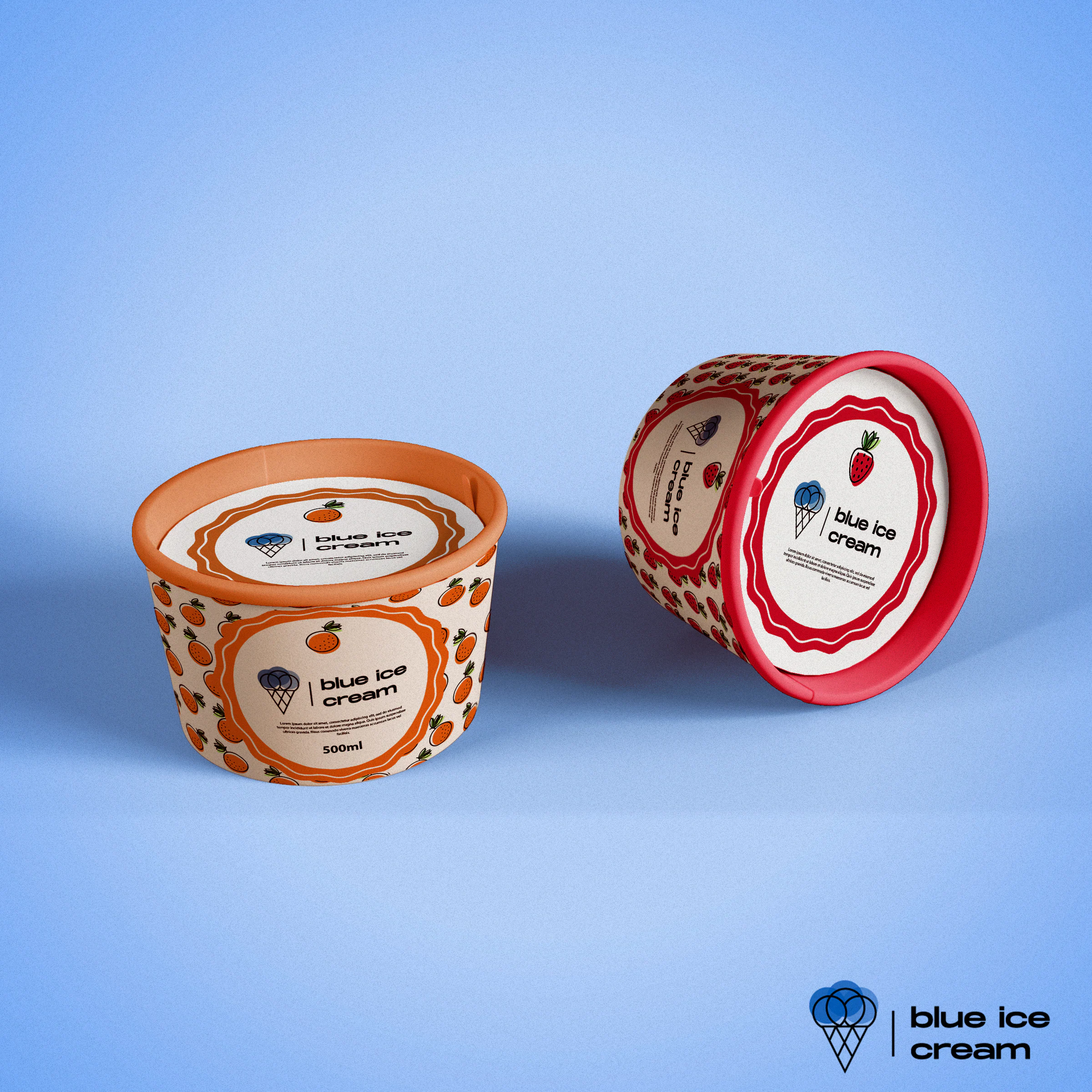
Logo and fruit-patterned 500ml tubs for a fictional ice cream brand, where colour tells each flavour apart.
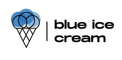
Blue Ice Cream is a fictional ice cream brand I worked on as a set brief: a logo plus a range of packaging illustrations for its products. The logo pairs a line-drawn cone holding three overlapping blue scoops with a lowercase wordmark, separated by a thin vertical rule. On the 500ml tubs, each flavour gets its own colour and a repeat pattern of outlined fruit: watermelon, mango, green apple, orange and strawberry. A wavy, scalloped badge frames the logo on the side of each tub and on the lid.